Cleef Coffee is a small, community-focused coffee business known for its warm atmosphere and fresh brews. To support growth and customer engagement, we designed a web app that allows the business owner to easily create and share digital coupons — making marketing as smooth as their coffee.
The platform is designed to help boost foot traffic, reward loyal customers, and simplify promotions — built for non-technical owners who value simplicity over complexity.
Small business owners often struggle with promoting deals and discounts in a simple, digital way. Many are not highly technical, so creating and sharing professional-looking coupons can feel intimidating. This project explores a digital coupon web app built specifically for owners like Cleef Coffee's — where the process is: log in, create a coupon, preview it, and share it in just a few clicks.
Local cafés, salons, and small shops rely on word of mouth or basic social media posts to attract customers. But designing a coupon that looks professional and distributing it effectively can be frustrating without the right tools. Owners need a simple, step-by-step solution that removes technical barriers while keeping things quick and efficient.
Physical small businesses that serve walk-in customers and rely on community connections and local marketing.
Comfortable with WhatsApp and Facebook, but not with design or marketing tools — needing a guided, intuitive flow.
Coupons shared via messaging apps, social media, or by generating a QR code that can be printed and placed in-store.
I compared competitor platforms and conducted interviews with two real small business owners to discover gaps and unmet needs in today's coupon tools.
Competitive Analysis| Platform | Target Audience | Key Strength | Key Weakness | QR Share | Templates | Non-Tech Friendly |
|---|---|---|---|---|---|---|

Loyalty |
Physical businesses | Works with POS, auto-updates | High cost, limited customization | ✓ | — | — |

Shopify |
Online stores | Built-in promotion tools | Platform-locked, complex setup | — | ✓ | — |

Loyverse |
Micro businesses | Free tier, very easy to use | Basic design control only | ✓ | — | ✓ |

Cleef App |
Coffee shop owners | Guided creation + share in one flow | Early stage | ✓ | ✓ | ✓ |
"Sarah runs her shop alone. She needs a no-fuss way to attract customers and run promotions — without ever touching a line of code."
"Daniel handles production, marketing, and web management alone. He values efficiency and sales data but has no time for technical troubleshooting."
To create a successful product, we carefully analyzed both user goals and business goals, then combined them into clear project goals — ensuring our design meets real user needs while supporting the business strategy.
A simple structure designed for small business owners. From login to dashboard, users can easily create, share, and track coupons through four main sections — organized for quick access and clarity.
Information ArchitectureUsers sign up or log in, create a coupon, preview it, then share it through multiple channels. Afterwards, they track performance in Analytics and History — making the whole process fast, guided, and effortless.
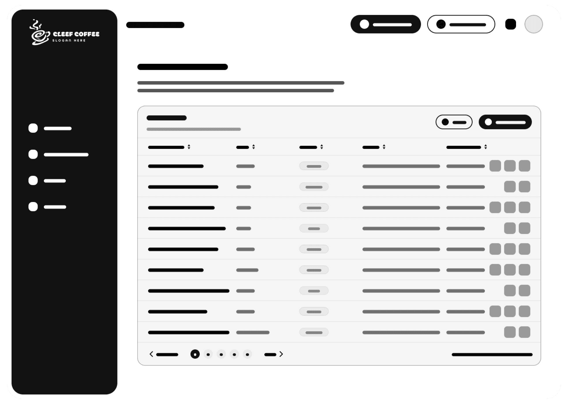
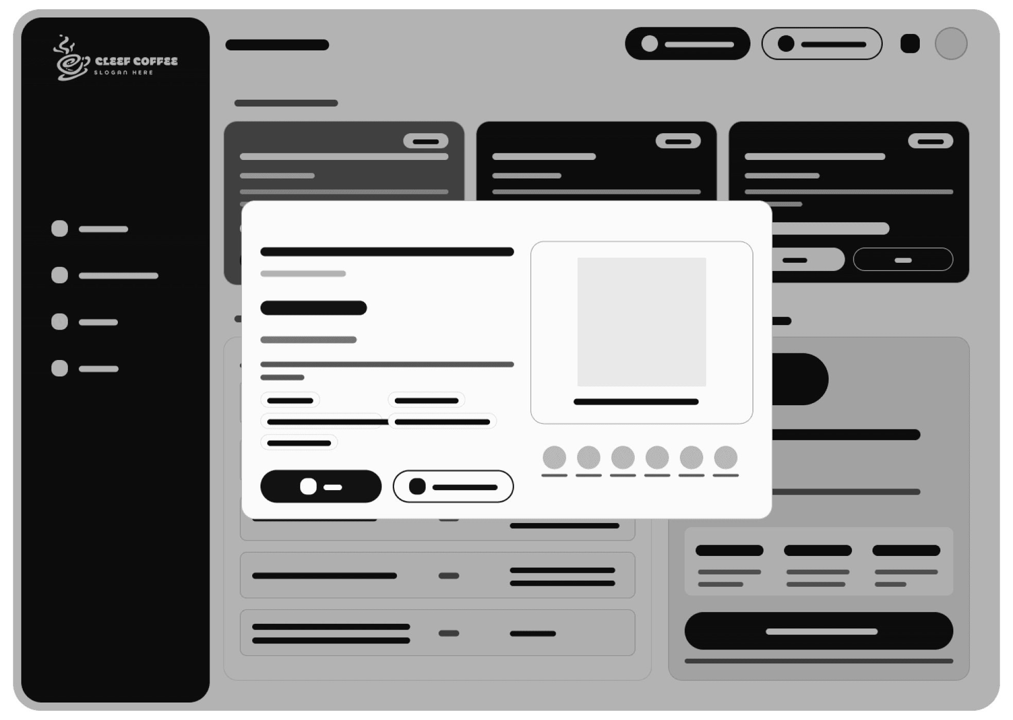
The wireframes outline the main user journey — from signing in to managing coupons. Each screen focuses on simplicity: a clean dashboard, clear form sections, easy sharing options, and a history view for tracking.
A brief overview of how each page's layout was planned based on UX research, user behavior, and content priority.
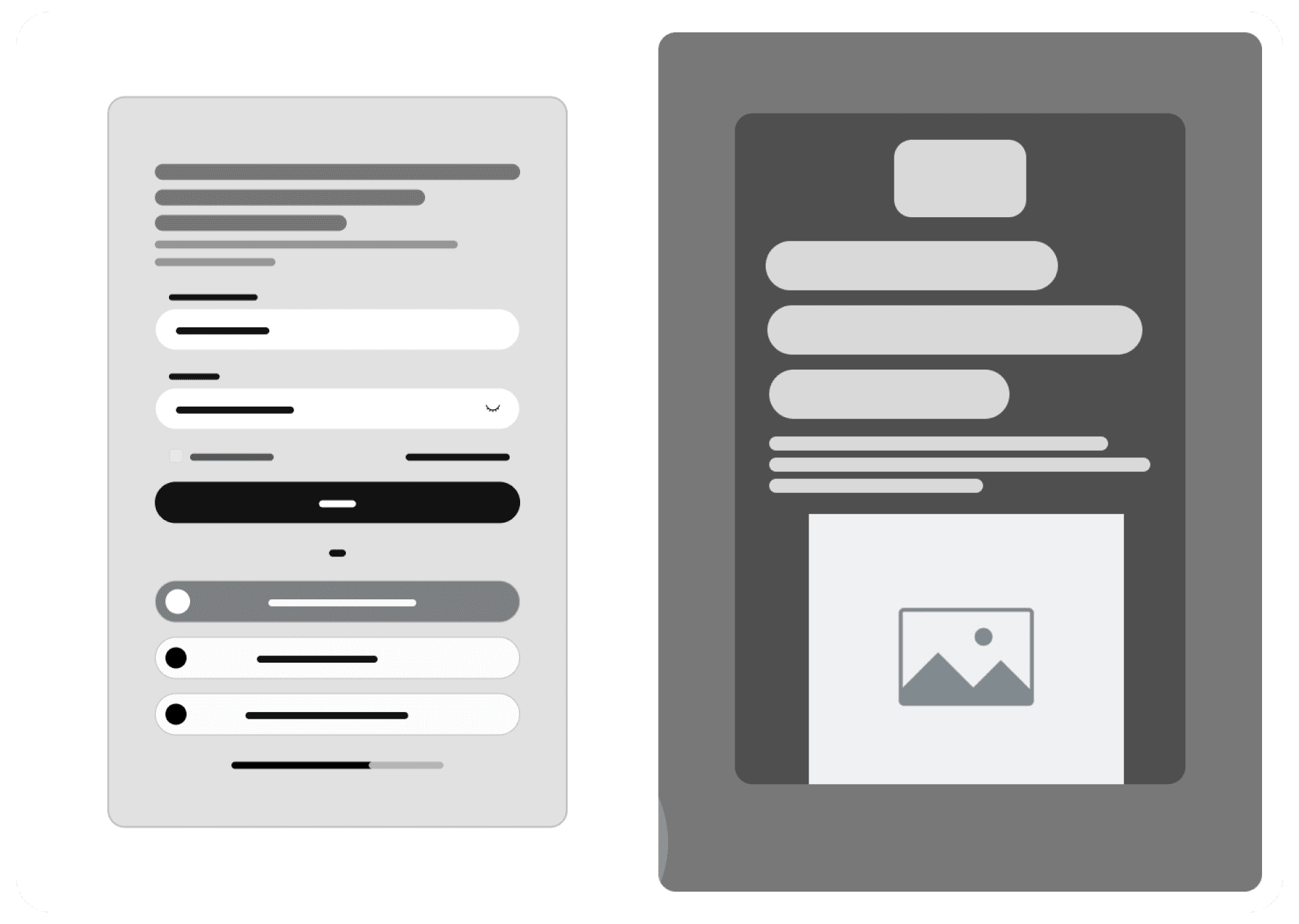
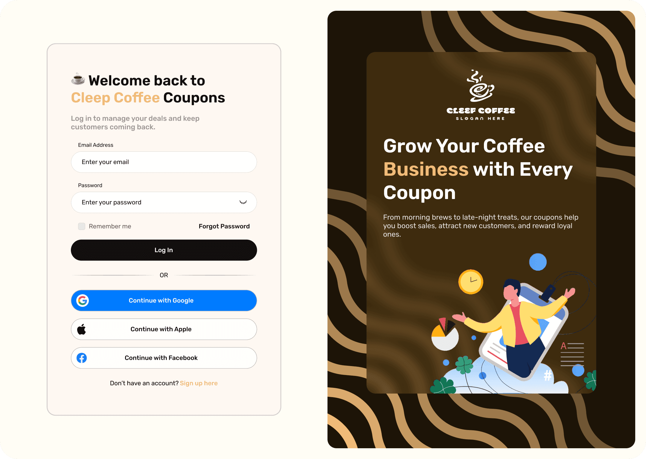
Centered single-column layout to reduce cognitive load. Only essential fields visible — no distractions. Brand logo and warm tone to create trust from first interaction.
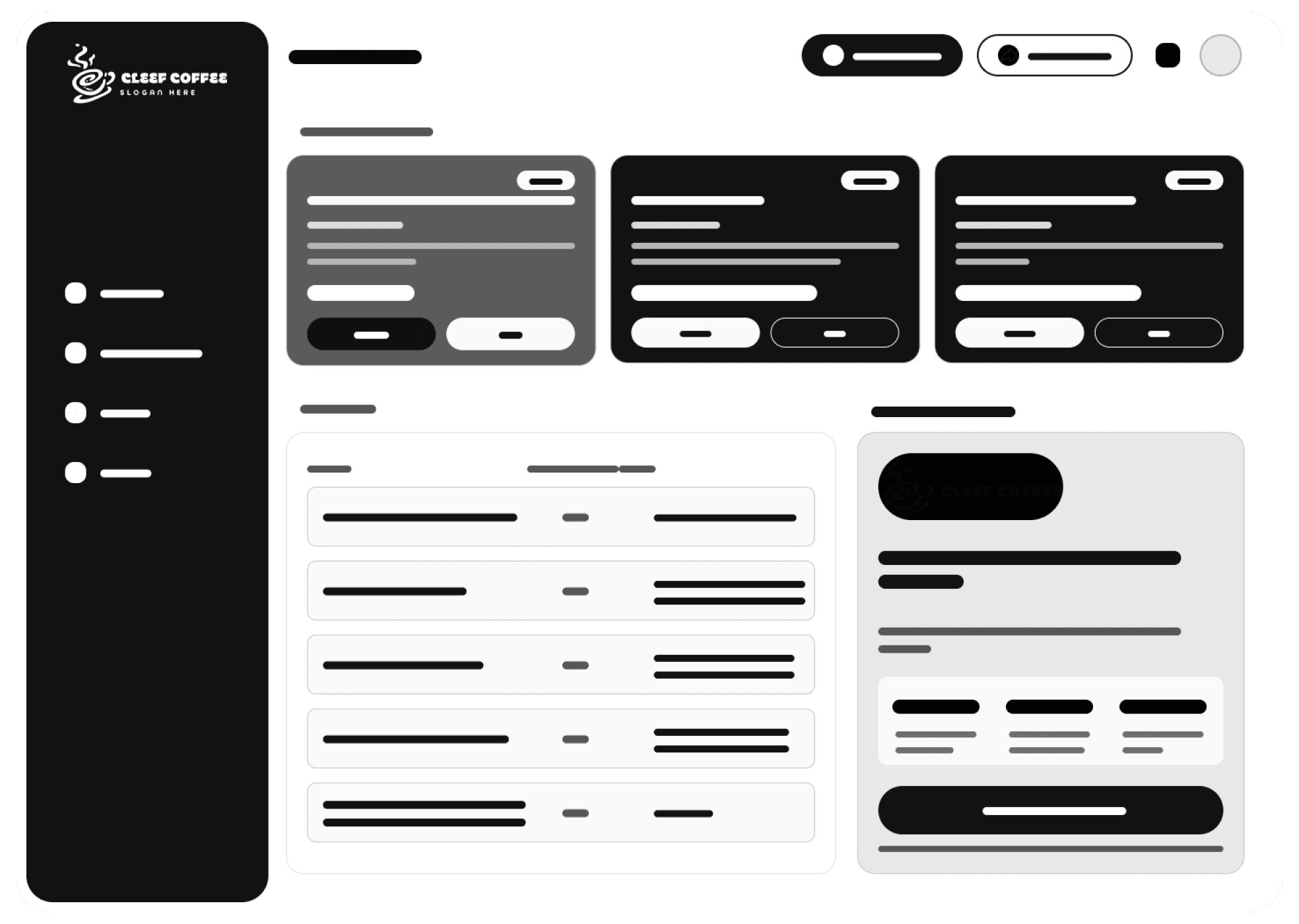
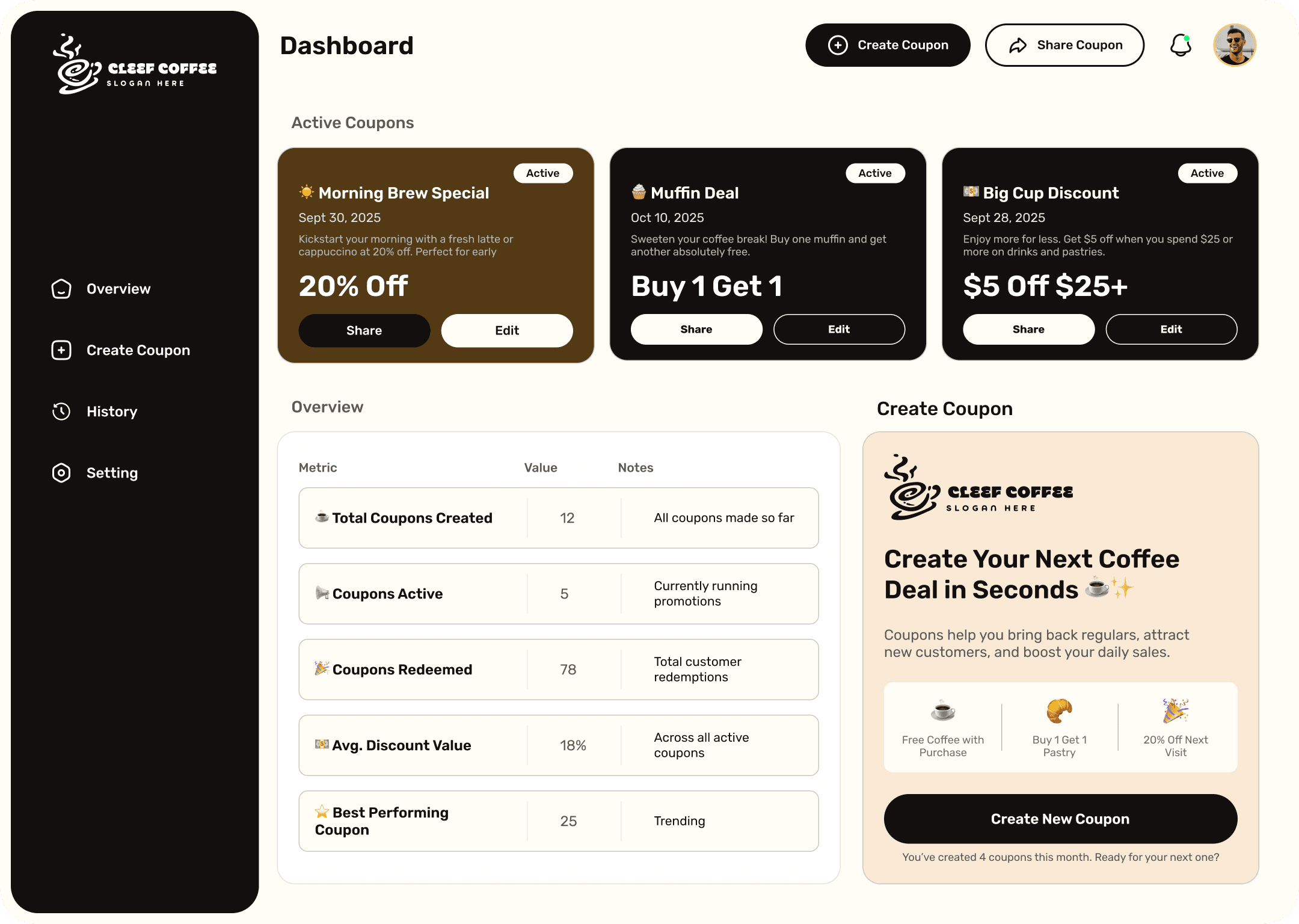
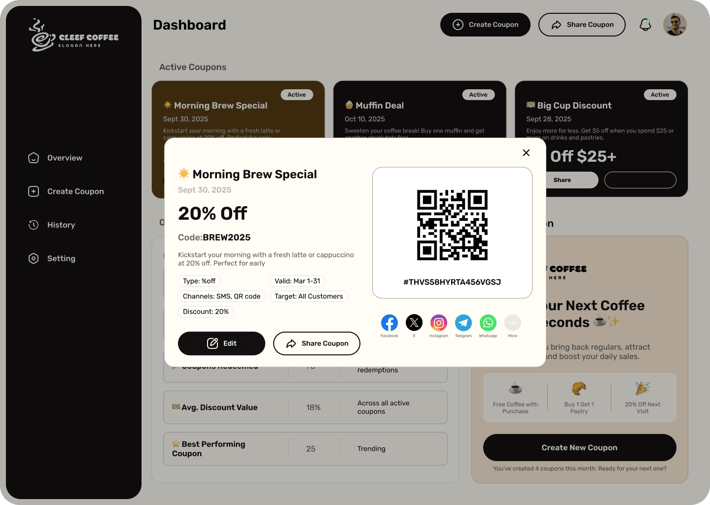
Left sidebar navigation for persistent access. Top area shows performance summary cards. Main content area highlights active coupons with prominent "Create Coupon" CTA.
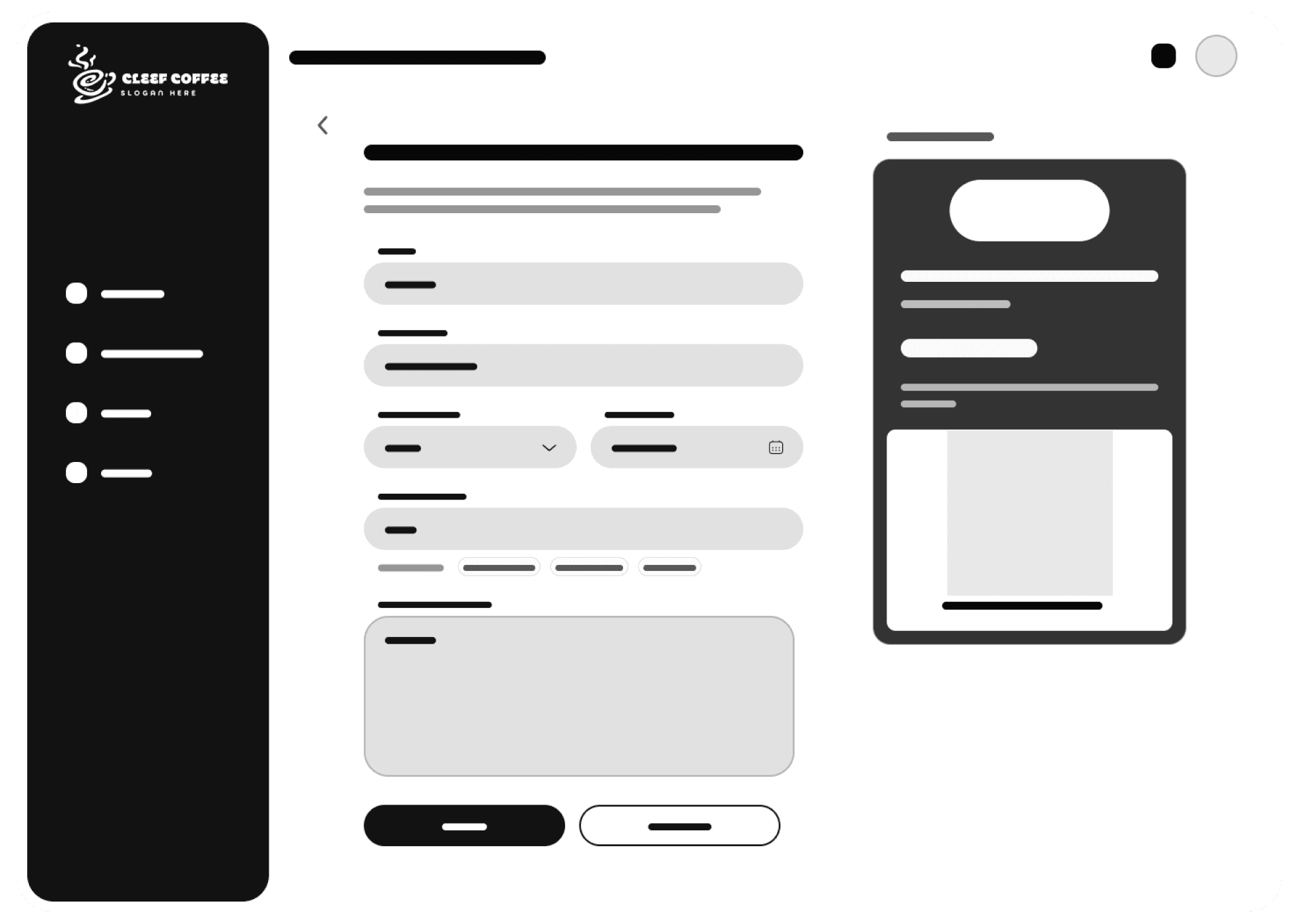
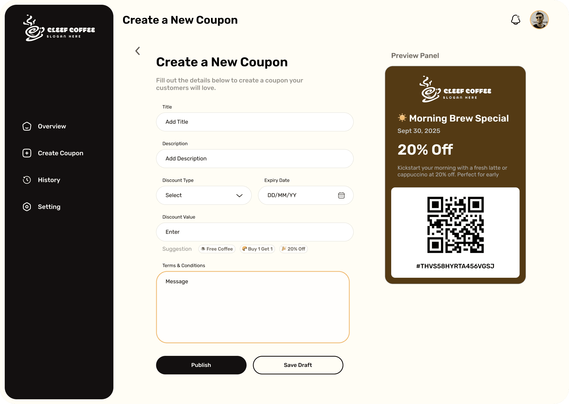
Step-by-step form layout with only essential fields: name, discount, expiry. Live preview panel on the right updates in real time, giving owners confidence before sharing.
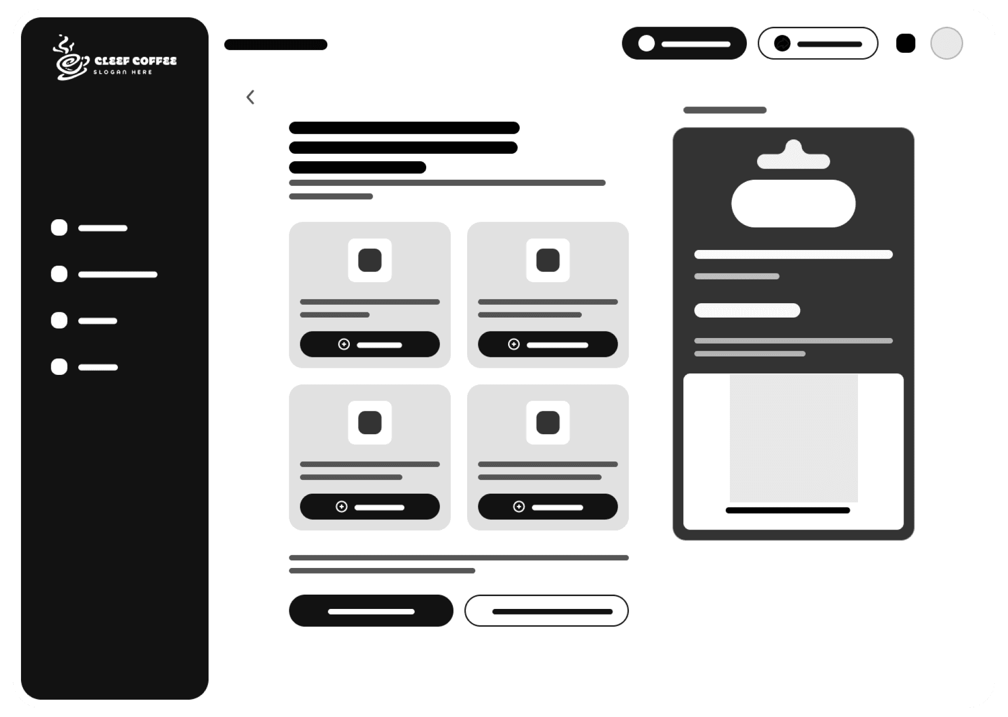
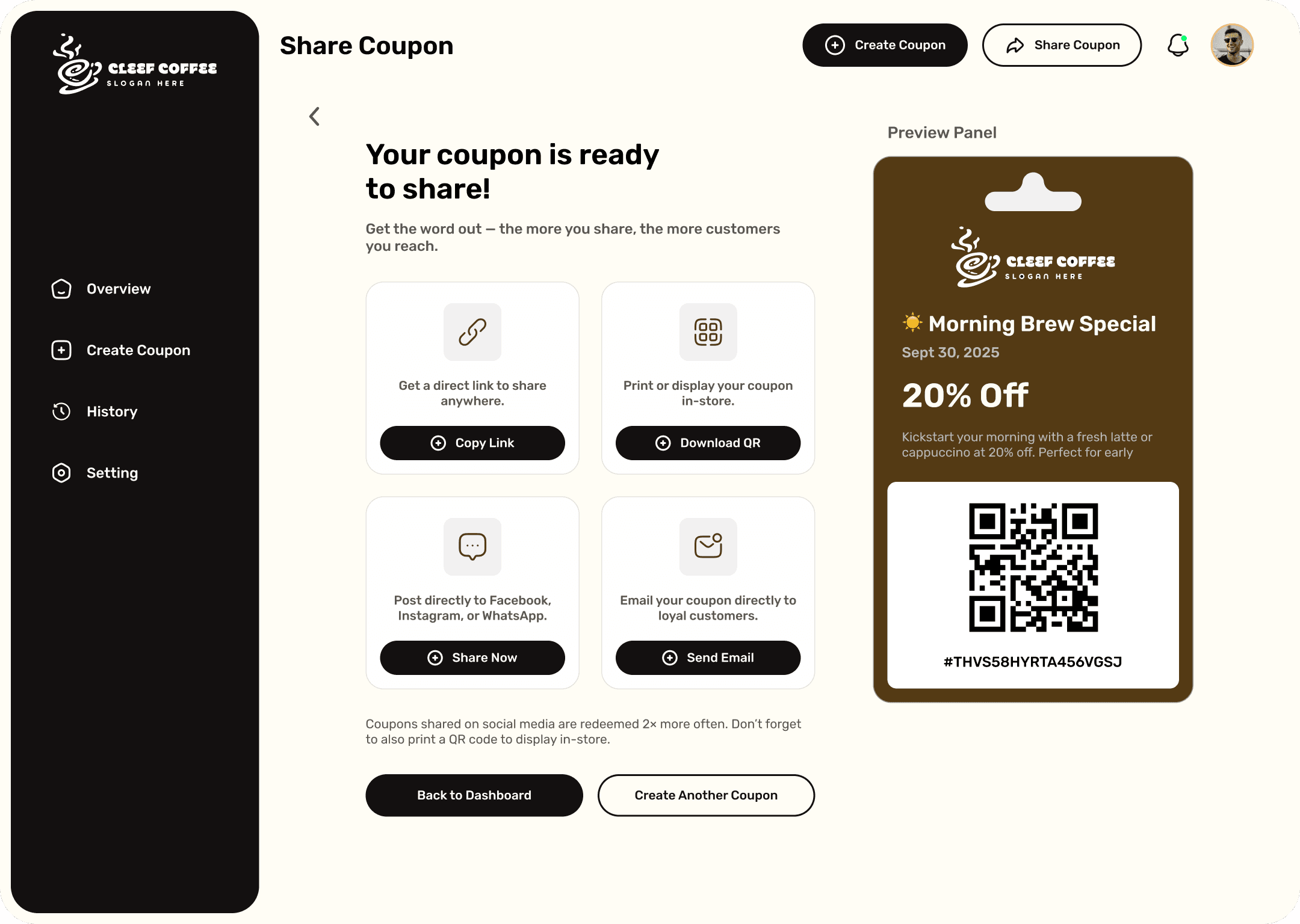
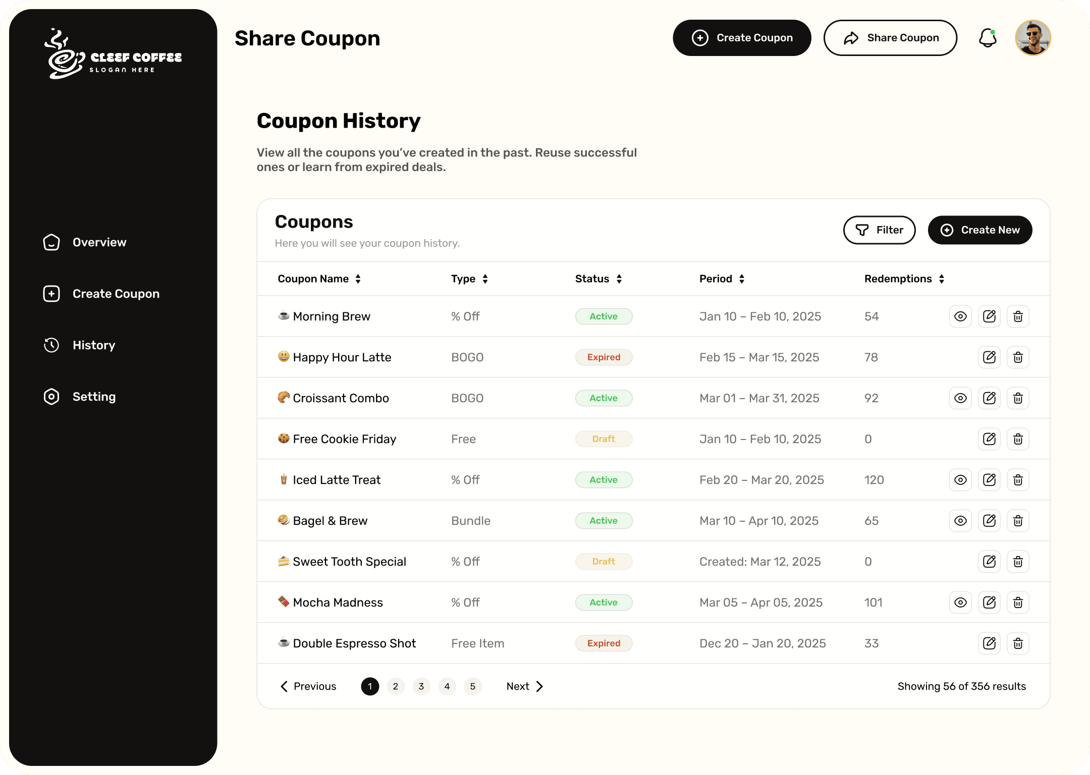
Share options presented as clear, tappable cards: QR code, WhatsApp, direct link. History page uses a table view sorted by recency with quick-access performance metrics.
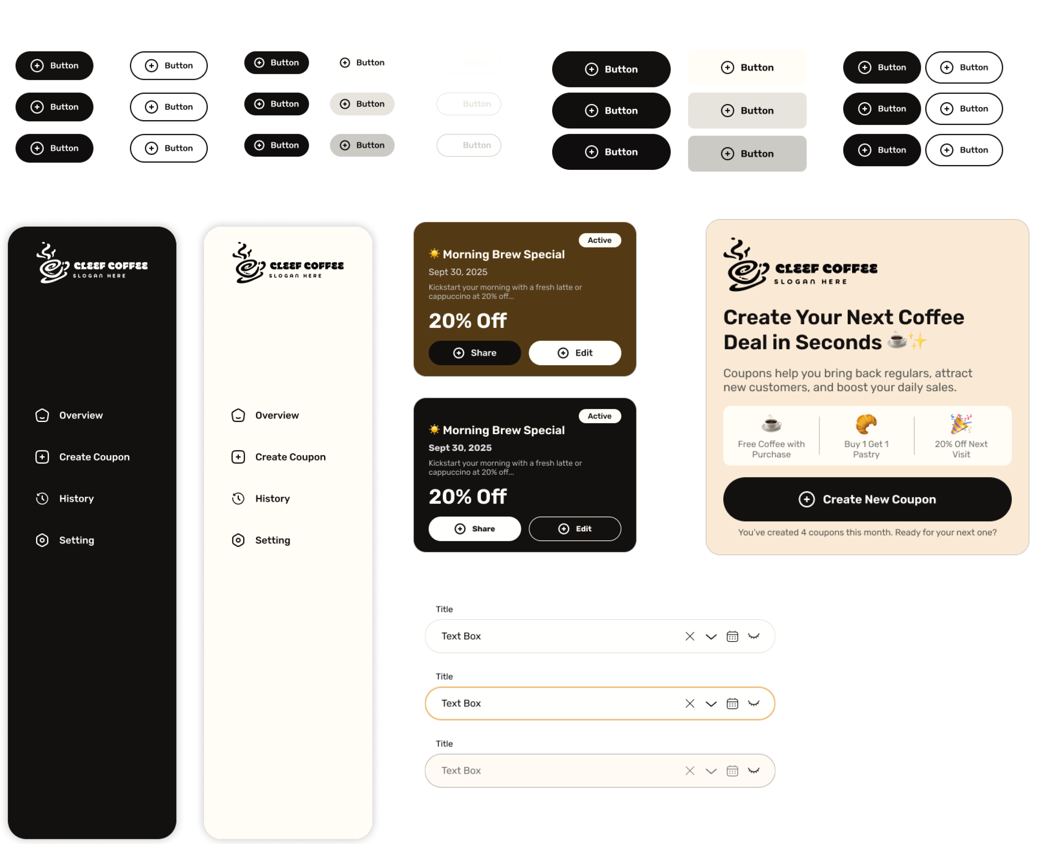
The UI is built to feel warm, modern, and welcoming — reflecting the cozy vibe of a small coffee shop. The design uses soft cream tones, rounded thinking, and a simple layout to help users quickly navigate and focus on creating and sharing coupons.
Instead of pure white, I chose a soft cream background to reduce harsh blue-light glare. The palette combines warm brown tones with coffee-inspired orange accents to make users feel the brand essence of a cozy café.
The Rubik font was chosen for its clean and approachable look — friendly and modern, making it easier for business owners to read and interact with content without visual distraction.
The UI elements are designed to feel intuitive and familiar — clean buttons, sidebar navigation for quick access, and CTA sections that guide users toward key actions like creating or sharing coupons.

These screens represent the final visual design of the web app, combining both UI and UX decisions into a polished product — crafted to guide coffee shop owners through a smooth and intuitive journey.
The primary objective was to evaluate how easily small business owners — especially those with little technical experience — could navigate and accomplish key tasks within the app.
After several rounds of planning, designing, and refining, the coffee coupon web app evolved into a simple yet powerful tool for shop owners. The final design makes it easy to create, customize, and share coupons in just a few steps — all from a clean, intuitive dashboard. Built with the owner's needs in mind, the experience feels efficient and user-friendly, helping businesses grow customer loyalty without any extra effort.
Removing unnecessary steps and options isn't lazy design — it's the right call for non-technical users. Every removed friction point became a conversion win.
The warm cream-and-orange palette wasn't just aesthetic. It made owners feel comfortable — like the app understood their world, not just their workflow.
Usability testing revealed critical CTA visibility issues that prototyping alone missed. Real users in real context caught things no design review could predict.