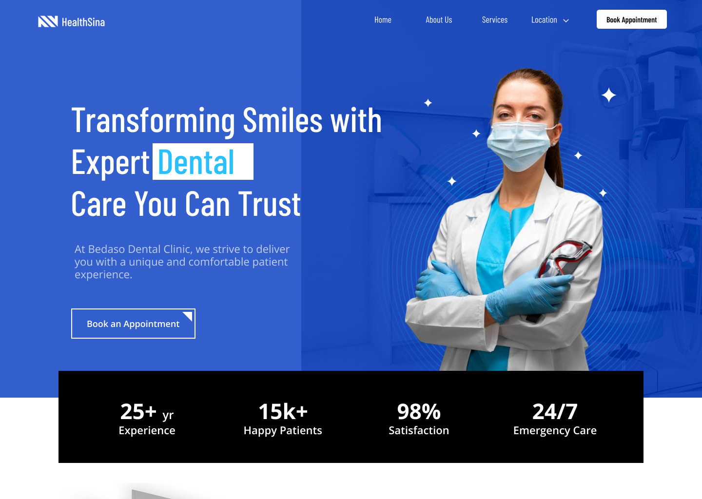
BrightSmile Dental Clinic is a modern, patient-focused practice offering general, cosmetic, and preventive dental care. The clinic combines professional service with a comfortable atmosphere to make dental treatment simple, stress-free, and accessible for all patients.
The challenge was translating that warm in-person experience into a digital platform that genuinely works for patients — one that reduces anxiety, simplifies booking, and builds trust from the very first click.
Going to the dentist is already something many people feel nervous about — the last thing they need is a confusing website in their way. The in-person experience was warm and professional, but the online journey told a different story. Patients struggled to find information, book appointments, or even figure out where the clinic was located.
The problem wasn't the services themselves — the clinic was great at what they did. The problem was how people experienced the clinic online. Pages felt cluttered, details were hidden, and booking felt like a chore. Potential patients were dropping off, current patients were frustrated, and the clinic's reputation wasn't shining through the way it deserved.
I compared four competitor dental websites to uncover gaps, best practices, and opportunities to stand out.
| Competitor | Target | Strengths | Weaknesses | Key Features |
|---|---|---|---|---|
Smile Design Studio | General public | Simple nav, clear visuals | Not family-tailored | BookingMobileLive Chat |
Atlanta Periodontics | High-end clients | Elegant, premium photos | Some info buried | BlogLocationChat |
Grand Street Dental | Young professionals | Fast booking, modern layout | Limited family content | Modern DesignMulti-Branch |
Petite Smiles Boutique | Families & children | Child-friendly, easy reads | No adult services | BookingMobile |
I reached out to real patients via social media and online dental communities to gather honest, first-hand feedback from people who use dental websites regularly.
"Daniel works long hours and relies heavily on online booking to manage appointments quickly without disrupting his busy schedule."
"Sarah wants a dental clinic that accommodates her family's needs and makes appointments simple for both herself and her child."
The IA defines how content is structured across the website — showing the hierarchy of pages and connections between them so users can always find what they need.
This flow maps the patient's journey from entry to a confirmed booking across multiple pages and user actions. It branches into two paths — a quick direct booking and a deeper browse through Services — that converge on the appointment page, with an alternative path looping back when the user books from a CTA.
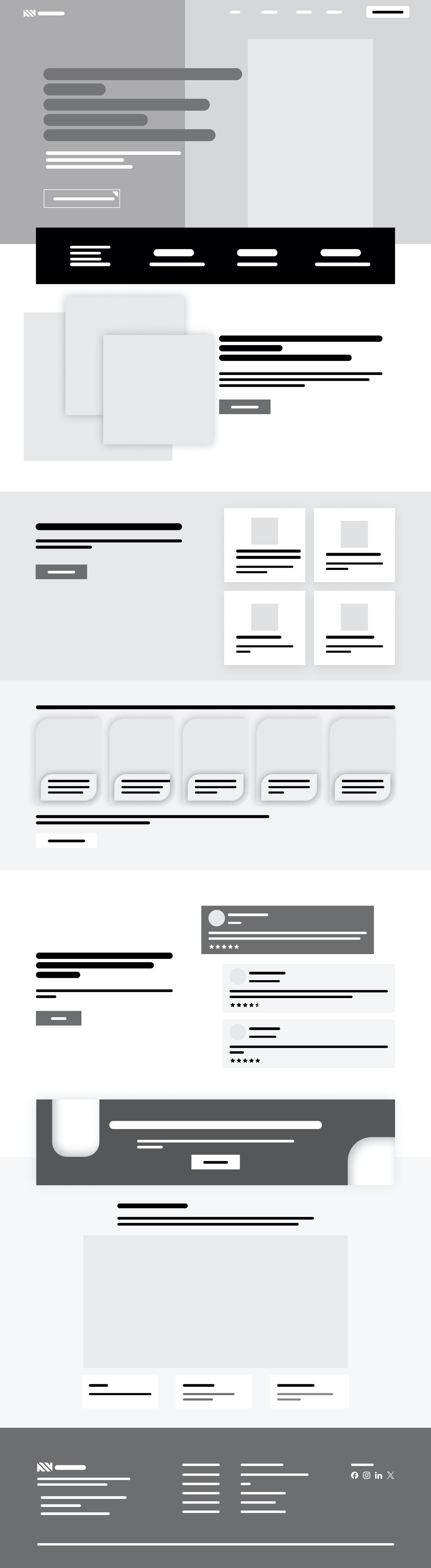
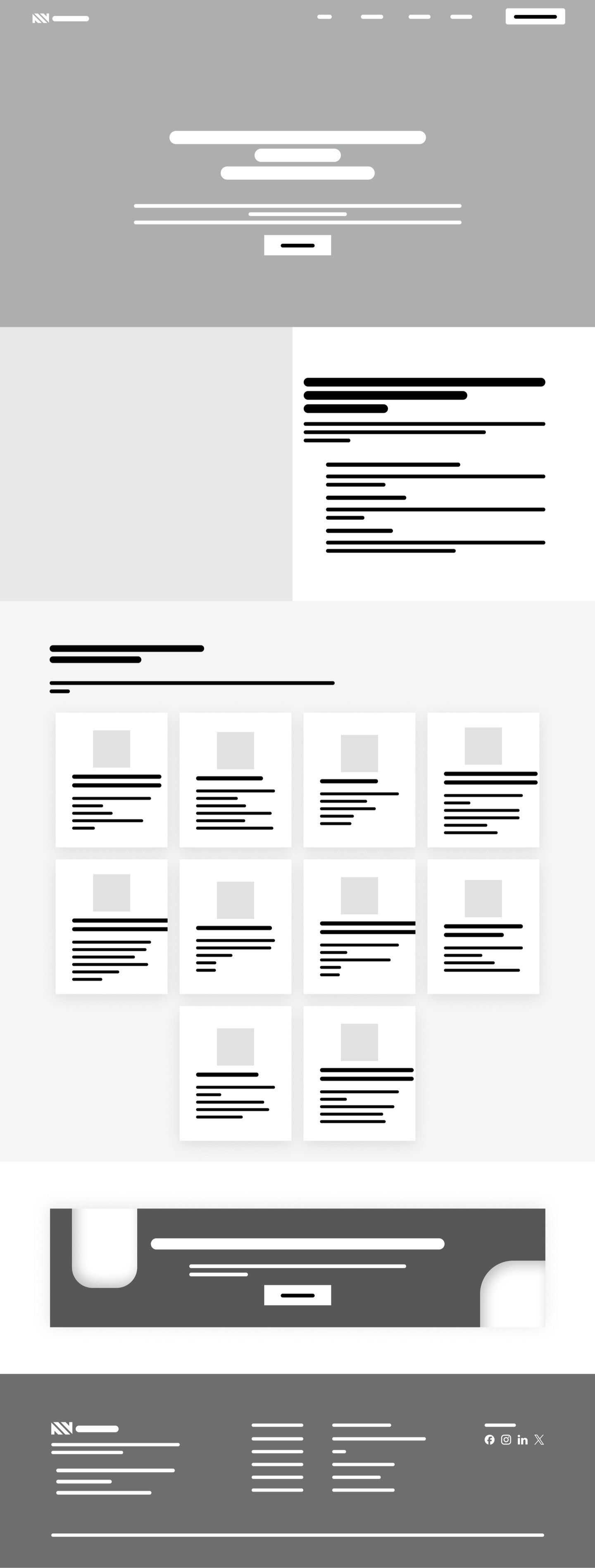
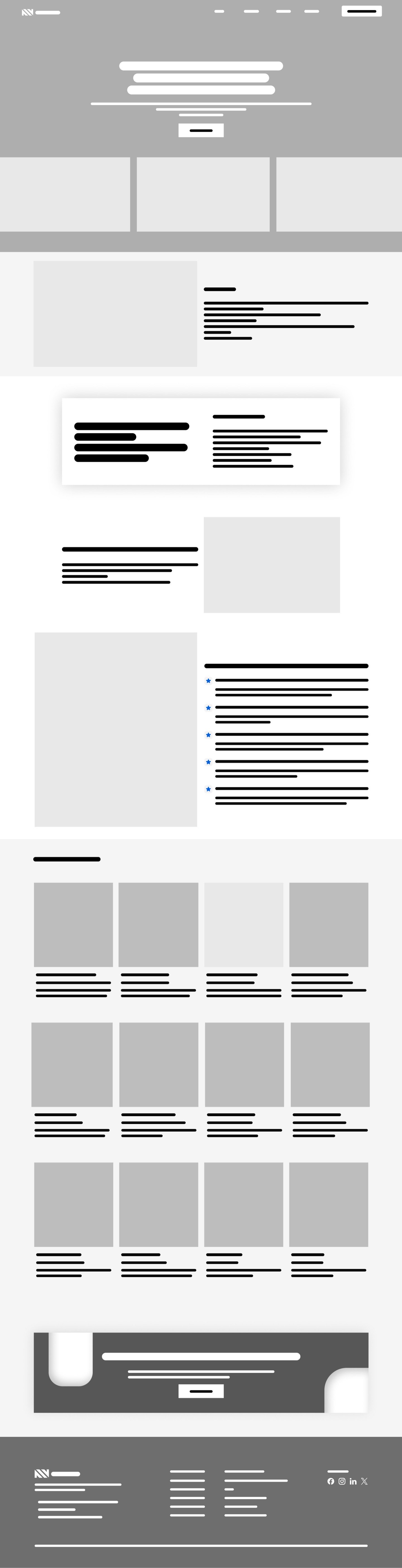
Low-fidelity wireframes strip away color and detail to focus purely on structure, layout, and content hierarchy — ensuring the right elements are in the right place before visual design begins.
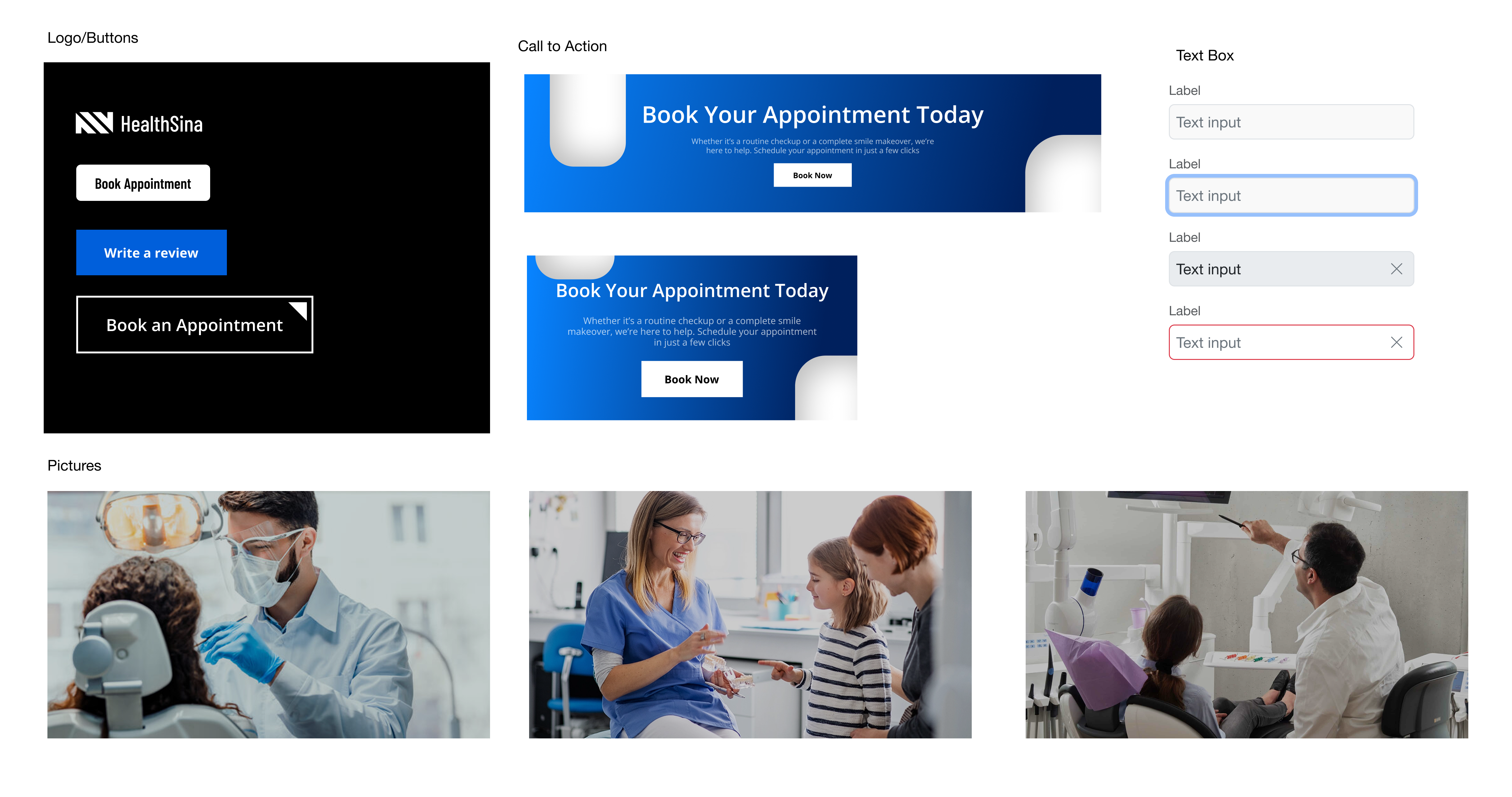
The UI design stage brings the wireframe structure to life — creating a calm, professional look that builds trust and guides patients from browsing to booking.
The color scheme uses calming blues and whites to convey trust and cleanliness, with a deep navy-to-blue gradient for CTAs.
Barlow Condensed for bold display headlines, Open Sans for all headings and body copy — creating a clear, professional typographic hierarchy.
Buttons, inputs, cards, and icons designed for clarity and consistency across all screens.
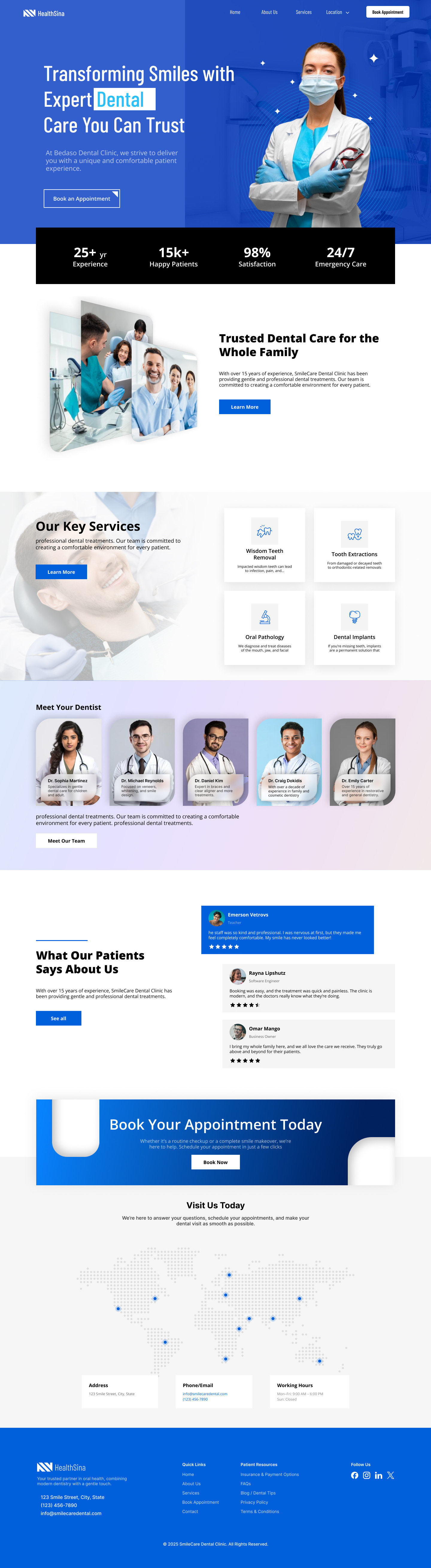
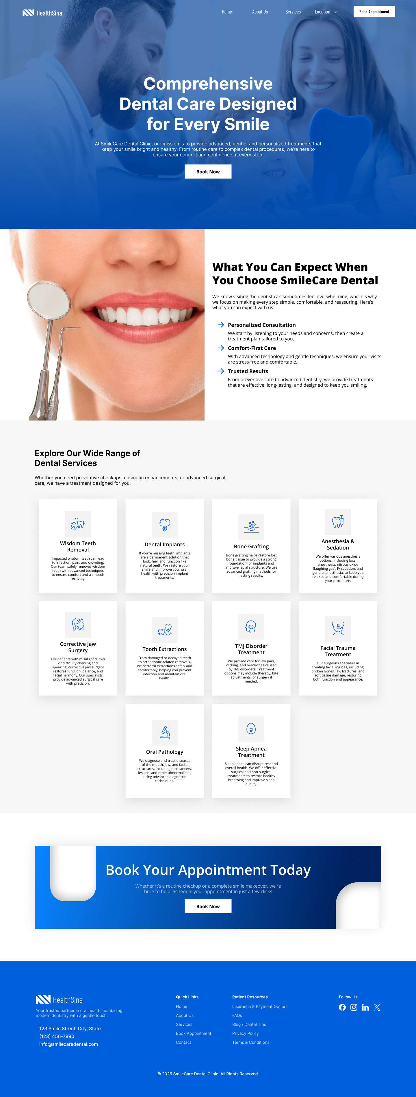
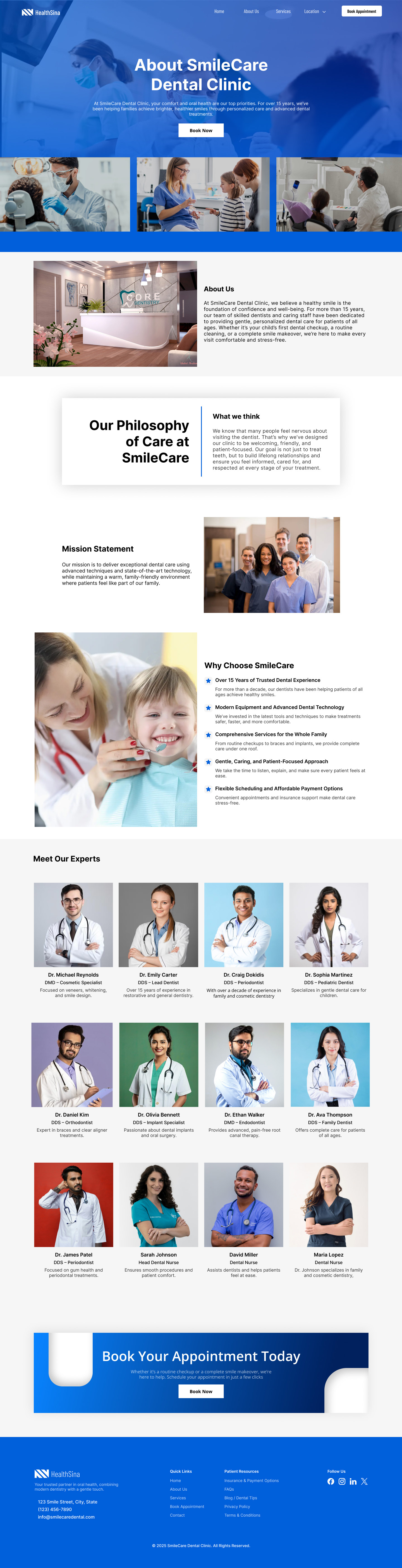
Six fully designed screens covering every key patient journey — from first impression to booking confirmation.
Welcoming hero, service highlights, and direct appointment access
Structured treatment cards with icons, descriptions and quick booking links
Doctor profiles, clinic story, and trust-building credentials
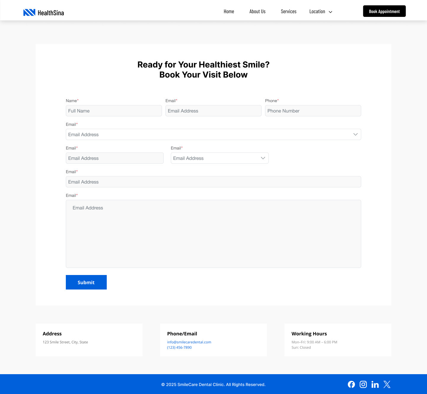
Step-by-step booking form with clear fields and progress feedback
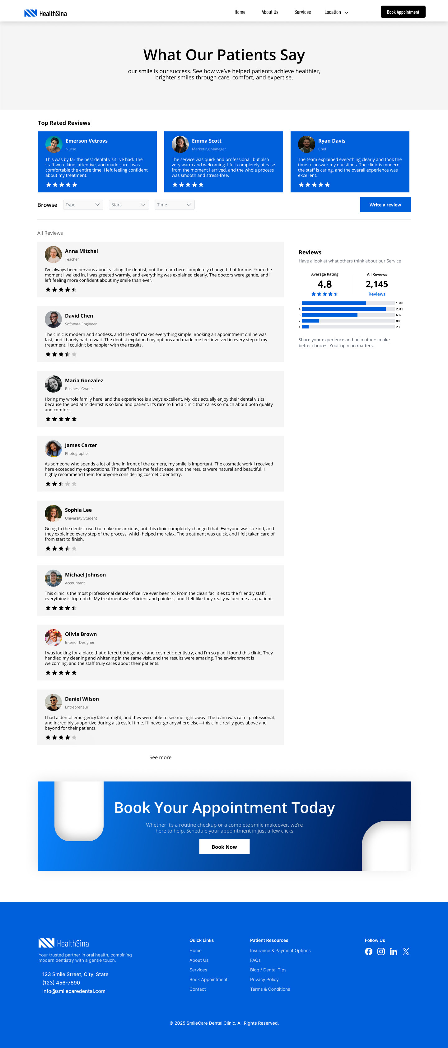
Patient testimonials, ratings, and a prominent call-to-action section
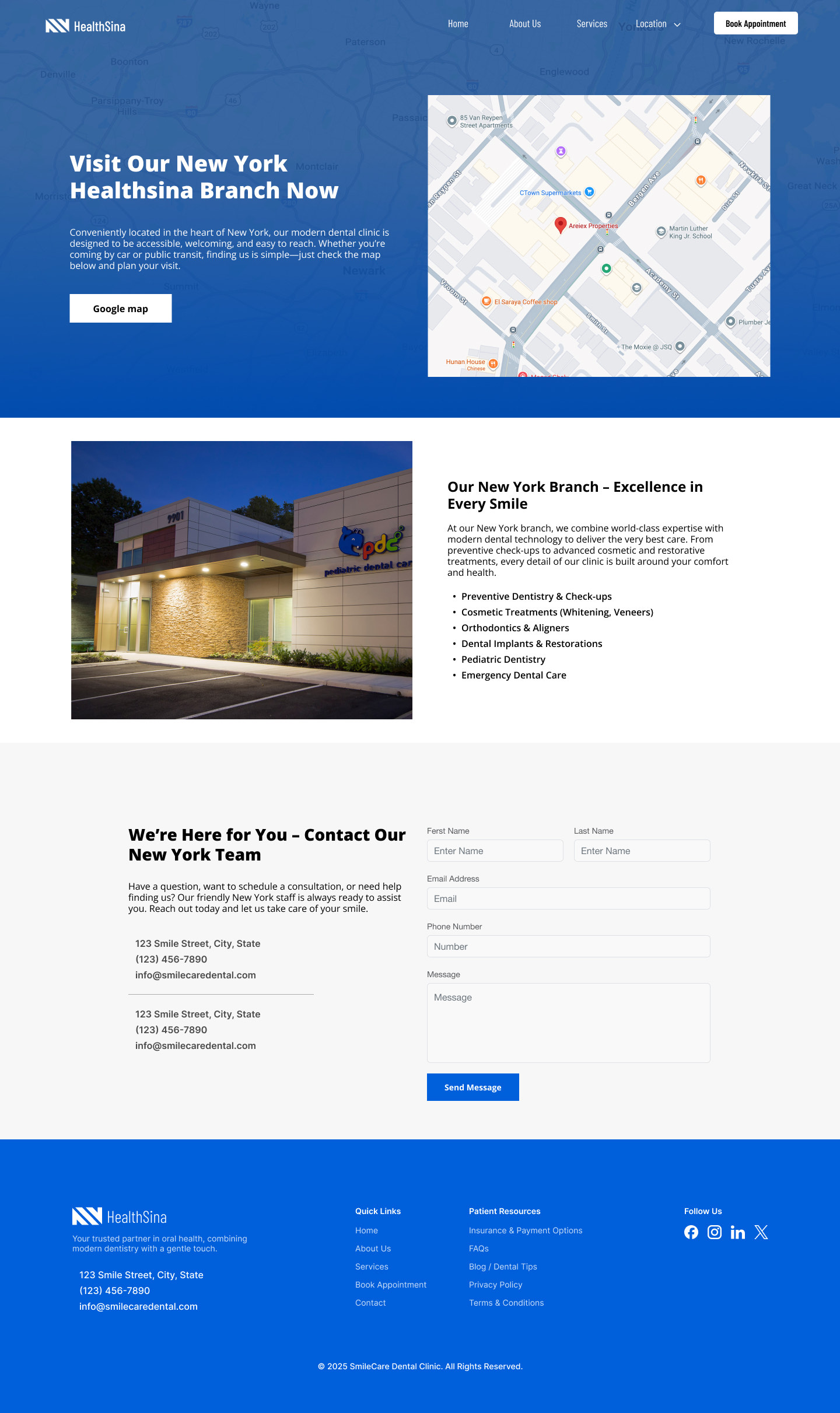
City branches, maps, clinic details, and direct booking links
Five participants tested the clickable prototype remotely. I measured time to complete, hesitation points, and confusion areas across three core tasks.
After several iterations of research, design, and testing, the dental clinic website came together as a modern, user-friendly platform. Booking, browsing, and finding the clinic are now all simple and intuitive — professional yet welcoming for patients of all ages.
Clean and easy-to-navigate desktop design across all six pages.
View Desktop Prototype →
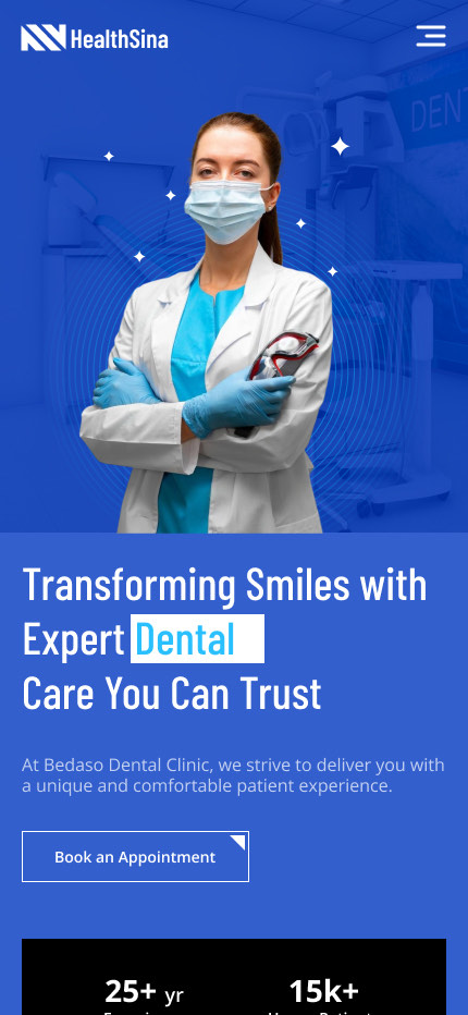
Optimized for quick access — booking and contact within thumb reach.
View Mobile Prototype →